Budget
September 11, 2020

Rich materials, bold art, striking architecture… high-end design has a way of grabbing our attention — and keeping it. So why not channel an opulent spirit in your own home? Though some spaces are blessed with great architectural elements, abundant millwork and natural light, adding the elements listed in this gallery will elevate a home and make a big impact. Here are 60+ budget-friendly ways to bring a luxurious look to your home, from investment buys to smart reno tips. Take your pick to make your home look a little bit richer — and a lot more memorable.

In case you missed it, the hottest hues of the moment are jewel tones, and we’re swathing everything from our walls to our furniture in emerald, amethyst and amber.
Photographer: Alex Lukey
Source: House & Home January 2016
Designer: Samantha Farjo

Instead of adding a piece of artwork above the bed, try a statement millwork piece behind the headboard instead. Designer Carmeon Hamilton painted a rectangular shape on the wall in Behr’s North Woods and attached long and short pieces of wood overtop to make the bed really pop.
Photographer: Kim Thomas
Designer: Carmeon Hamilton

Ornate, gilded and glamorous all come to mind when we think of the must-have mirrors for 2020. Look for these pieces in antique shops or flea markets — the grander, the better.
Photographer: Joann Pai
Source: House & Home September 2019

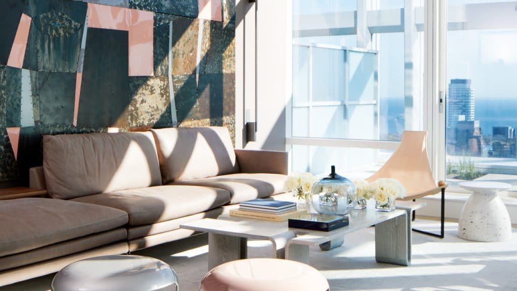
Take a page from this glam penthouse living room: a Zanotta sofa, leather sling chair and powder coated aluminum stools in blush pink and silver by Herve Van der Straeten all add softness with their curvaceous shapes, making the space feel anything but cookie-cutter.
Photographer: Virginia Macdonald
Source: House & Home December 2019
Designer: Katherine Newman

There is something so elegant and luxurious about the color purple — and it’s surprisingly soothing in the bedroom. “I always wanted a bedroom wall with patterned fabric or brightly colored paint — not boring beige,” says the owner of this cheerful condo, whose wish came true with panels of velvet lavender fabric.
Photographer: Stacey Brandford
Source: House & Home October 2019
Designer: Christine Johnson

We love a sleek white bathtub as much as the next person, but when we laid eyes on this elegant Italian-made piece, we knew patinated marble was the new look of luxury in bathroom design. Pair with wooden accents to ground the look.
Photographer: Alex Lukey
Source: House & Home October 2019
Designer: John Baker & Juli Daoust-Baker with Christine Ho Ping Kong and Peter Tan of Studio Junction

Looking for an easy update with maximum impact? Organize your book spines by color! This simple method keeps your favorite tomes neat and tidy, and doubles as art.
Photographer: Alex Lukey
Source: House & Home May 2020
Designer: Daniel Harland, Roundabout Studio

Swap out your basic, neutral headboard for something seriously statement-making. In this luxurious Toronto home, H&H‘s 2019 Designers to Watch Carey Mudford and Erin Coe added a backlit onyx headboard to bring the drama to the bedroom. Turns out, stunning stone doesn’t just belong in the kitchen or bathroom.
Photographer: Alex Lukey
Source: House & Home December 2019
Designer: Carey Mudford & Erin Coe; Architecture by Lorne Rose Architect

It may seem small, but adding integrated lights to a walk-in closet takes it from “meh” to marvellous. Lighting acts as a spotlight to showcase an enviable shoe collection or the latest season’s wardrobe must-haves.
Photographer: Valerie Wilcox
Source: House & Home September 2020
Designer: Nicholas Ancerl & Tara Finlay, Ancerl Studio

Elevate an empty corner in the bedroom with a hanging bubble chair — perfect for adults and kids alike. “It’s a great chair; it’s very playful,” says homeowner and hotelier Christiane Germain. The see-through material and silver detailing makes it feel modern, not juvenile.
Photographer: Maxime Desbiens
Source: House & Home October 2020
Designer: Jane Charron

A modern take on the popular barn door is a savvy way to maximize space and style. This custom version was inspired by Moroccan-style sliding doors and adds plenty of privacy for the guest bedroom.
Photographer: Tracey Ayton
Source: House & Home September 2020
Designer: Ben Leavitt, Plaidfox

Designer Katherine Newman knows how to turn any corner into a design moment — even a compact vestibule on the 65th floor of Toronto’s Shangri-La Residences. An oversized mirror and dramatic branches show off the apartment’s high ceilings.
Photographer: Virginia Macdonald
Source: House & Home December 2019
Designer: Katherine Newman

Display your curated collection of cookware, ceramics and design accessories (yes, artwork belongs in the kitchen) with clean-lined shelves in a bold black. It’s one of the biggest kitchen trends right now, and we predict it’s not going anywhere anytime soon.
Photographer: Larry Arnal
Source: House & Home November 2018
Designer: Lea Legg of Acorn Studio & Angela Bobanovic of Angela Bobanovic Design
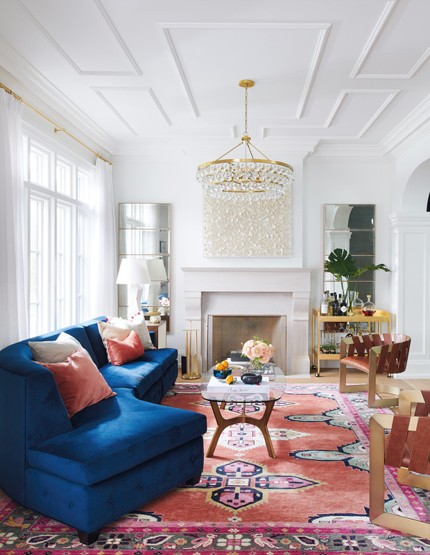
Think of it as artwork for your floor. This contemporary rug by Caitlin Wilson looks like an antique find, and it pulls the room together, injecting life and personality into the space. A well-made rug can last for decades, so it’s also a great investment.
Photographer: Alex Lukey
Source: House & Home April 2019
Designer: Feasby & Bleeks
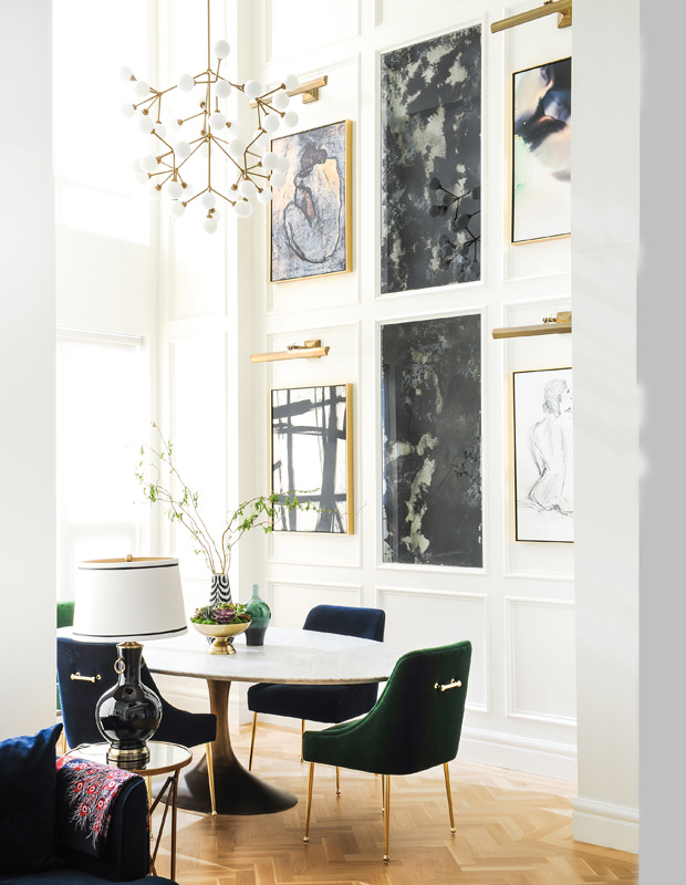
The art in this West Coast condo is well curated, but not all of it comes with a hefty price tag (one piece is by the owner’s teenage daughter). What makes it feel luxe is the way the art is elevated with beautiful picture lighting, meant to enhance the gallery-like atmosphere. Bonus: it looks gorgeous at night too.
Photographer: Tracey Ayton
Source: House & Home November 2018
Designer: Denisa Nica
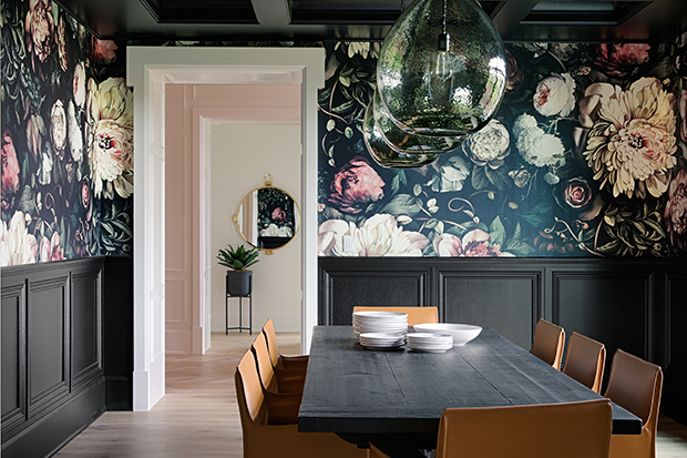
Understated pendants and halogen pucks can never hope to pack the punch of a generously scaled fixture. For added impact, think in multiples. In this dramatic dining room, a trio of pendants is balanced by airy glass shades, so they don’t appear heavy.
Photographer: Phil Crozier
Source: House & Home June 2018
Designer: Reena Sotropa & Alanna Dunn
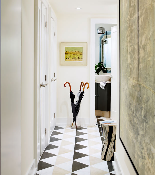
Not every tile has to be real stone to look expensive. In this case, designer Sarah Richardson had three kinds of budget-friendly square tiles from a big-box store, which were cut in half and then installed in a diamond pattern. The resulting pattern looks incredibly fancy in this condo foyer.
Photographer: Stacey Brandford
Source: House & Home February 2013
Designer: Sarah Richardson
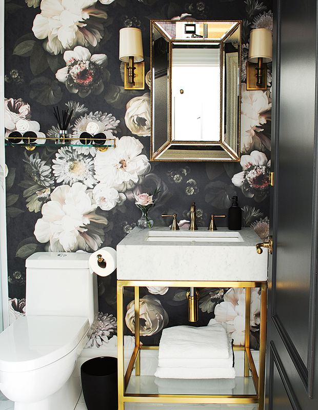
Choosing an iconic wallpaper — like Ellie Cashman’s overblown florals — lends instant cachet to a room. Powder rooms are an economical way to show off an instantly recognizable high-end wallpaper.
Photographer: Tracey Ayton
Source: House & Home November 2018
Designer: Denisa Nica

There’s a sense of order and calmness that comes from using mirroring elements to create a symmetrical balance. Twin benches, consoles and sconces help frame a stunning staircase.
Photographer: Phil Crozier
Source: House & Home June 2018
Designer: Reena Sotropa & Alanna Dunn
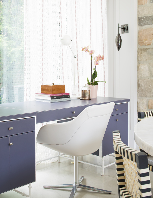
Elevate a home office with a chair that doubles as modern art. This sleek version looks anything but workaday, and along with a lavender desk, it is a welcome addition to any room of the house.
Photographer: Alex Lukey
Source: House & Home October 2014
Designer: Katherine Newman
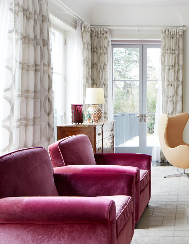
Drapes that “kiss” the floor look rich and oh so opulent. If the ready-made panels are store bought, adjust the height of the rod so there is no gap between the drapery and the floor. The window treatments will look tailored and more custom.
Photographer: Virginia Macdonald
Source: House & Home March 2015
Designer: Katherine Newman
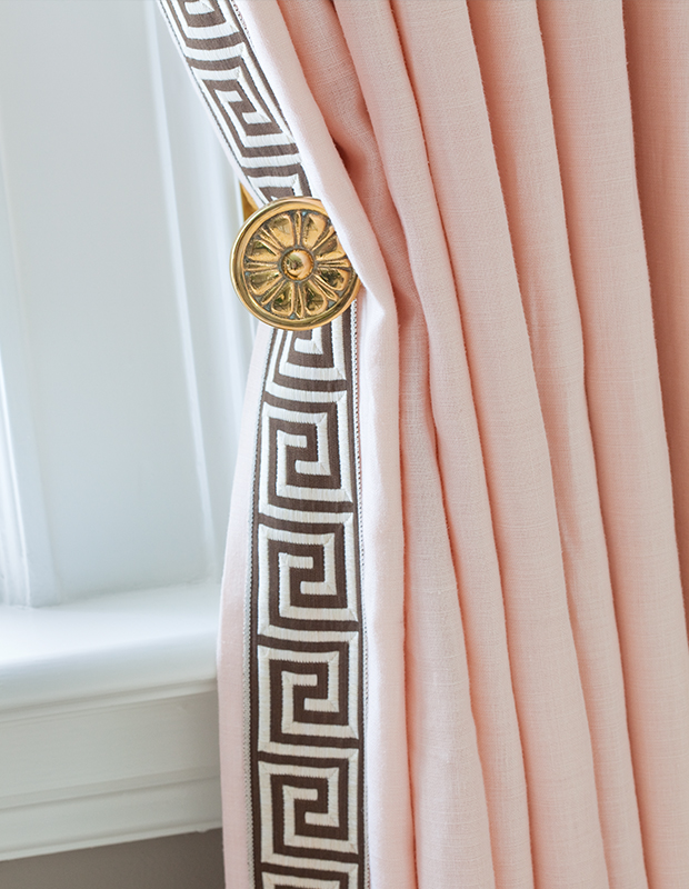
Adding tape — like this Greek key design or grosgrain ribbon — to drapery is a well-loved designer trick. The materials aren’t expensive, and it adds a polished look to window treatments.
Photographer: Virginia Macdonald
Source: House & Home April 2011
Designer: Anne Hepfer
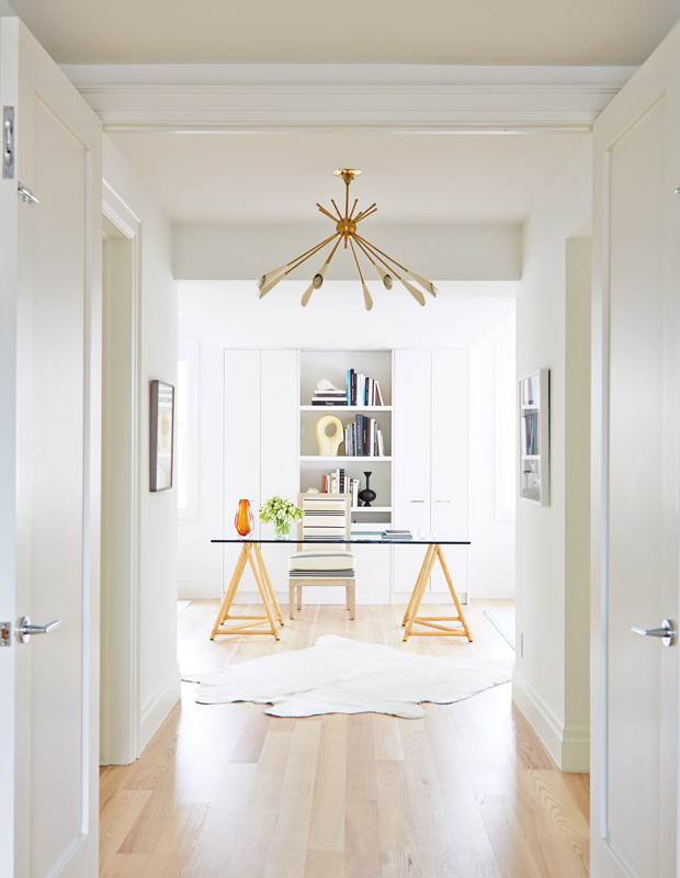
There’s no denying that the impact of white walls has been used by high-end retailers (and art galleries) for years. It puts the focus on the objects inside, makes rooms seem larger and more curated and doesn’t cost more than a few gallons of paint.
Photographer: Stacey Brandford
Source: House & Home March 2014
Designer: Lloyd Ralphs Design
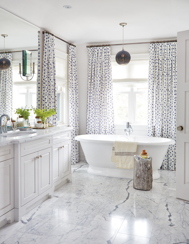
This fixture has dropped in price dramatically in recent years, making them much more accessible. This tub stands head and shoulders above a basic alcove tub, so if there is space, take the plunge. Sculptural tubs will make the bathroom look spa-like and refined.
Photographer: Virginia Macdonald
Source: House & Home August 2014
Designer: Robyn Madeline
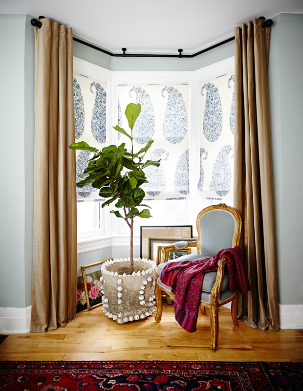
The fiddle leaf fig has been the darling of the design world — and with good reason. The sculptural shape creates major impact — especially when potted in a standout planter — but it’s the scale that makes this tree look expensive.
Photographer: Angus Fergusson
Source: House & Home October 2013
Designer: Morgan Michener & Kai Ethier
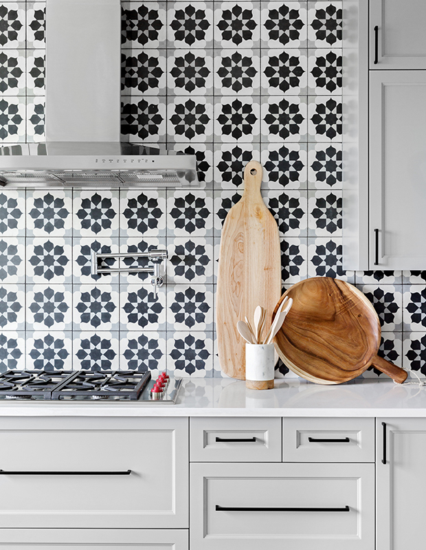
Opting for an entirely tiled wall instead of a traditional backsplash ups the luxe factor in a kitchen — plus, it’s practical too.
Photographer: Phil Crozier
Source: House & Home June 2018
Designer: Reena Sotropa & Alanna Dunn

Reflective surfaces are a cornerstone of opulent interiors. Mirrored pieces bounce around the light and also appear lighter than air, for a result that looks equally uplifting and posh.
Photographer: Stacey Brandford
Source: House & Home March 2014
Designer: Lloyd Ralphs Design
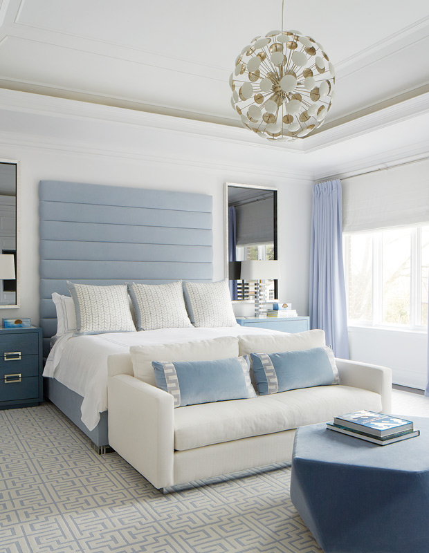
This plush treatment adds plenty of sophisticated comfort to upholstered furnishings, whether it’s a restaurant banquette or a headboard.
Photographer: Viriginia Macdonald
Source: House & Home December 2018
Designer: Anne Hepfer
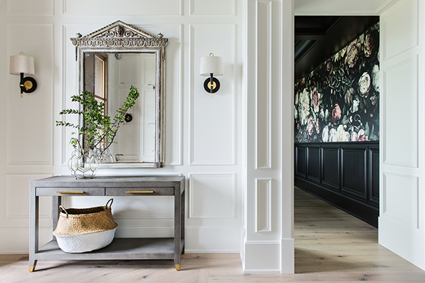
Actual panelling adds depth and character to rooms that may be lacking in architectural distinction. The real thing is pricey (no debate about that), but you can mimic the look with applied mouldings. Once they are painted, it’s difficult to distinguish the faux effect from the real thing.
Photographer: Phil Crozier
Source: House & Home June 2018
Designer: Reena Sotropa & Alanna Dunn
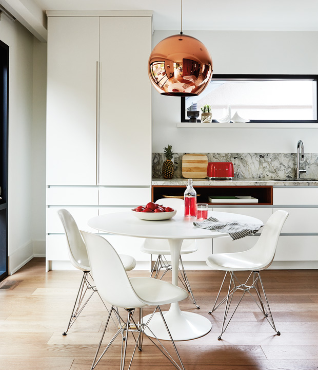
Adding a designer pendant or chandelier to a kitchen is a foolproof way to increase its style quotient (check out online retailers for markdowns if you’re on a budget). Invest in a piece that makes a serious statement, like this glossy Tom Dixon design.
Photographer: Stacey Brandford
Source: House & Home March 2017
Designer: Shirley Meisels
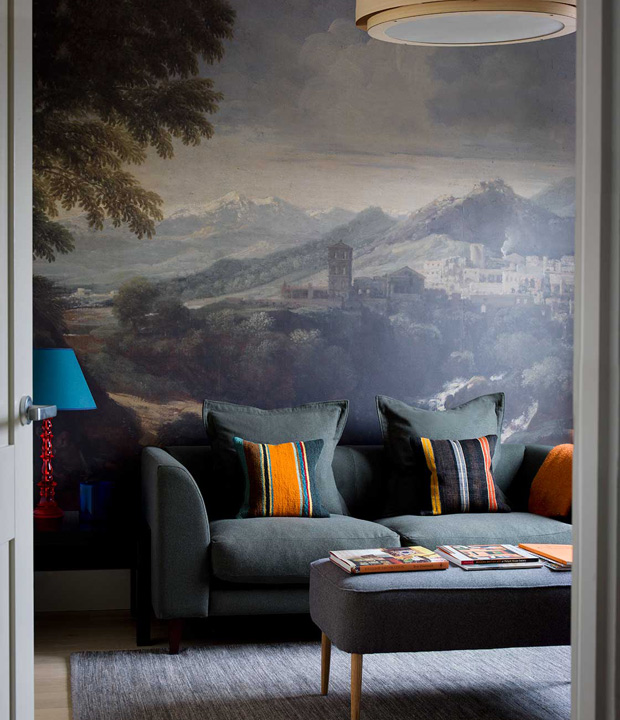
A painterly design or pastoral landscape brings instant gravitas to a room, and these days, elegant removable murals are easy to find. Opt for darker, more dramatic tones to keep the look sophisticated.
Source: Ben Penetreath
Designer: Ben Penetreath
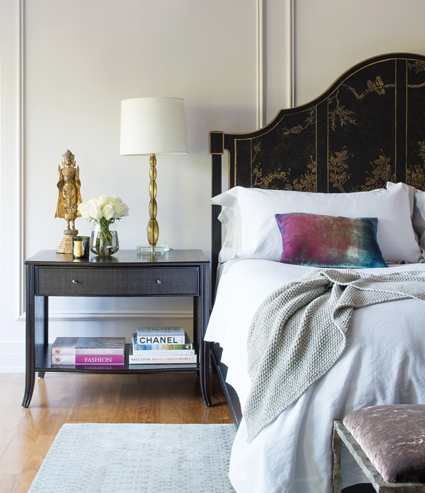
You won’t regret investing in good quality, high-thread count sheets and shams. Pure white linens will deliver a suite-like vibe and let you layer on color with accent pillows and throws.
Photographer: Alex Lukey
Source: House & Home February 2015
Designer: Kim Lambert

Adding a personal touch to linens is a definite luxe touch, especially in a space that’s frequented by guests, like this high-impact powder room. Hand towels aren’t just embroidered with an initial, they also match the playful Scalamandre wallpaper.
Photographer: John Gruen
Source: House & Home March 2018
Designer: Garrow Kedigian

A long, elegant chaise instantly connotes languor and luxury. Place one in a principal bedroom, living space or den, then pair it with a small side table to place your cocktail on.
Source: Studio Ashby
Designer: Studio Ashby
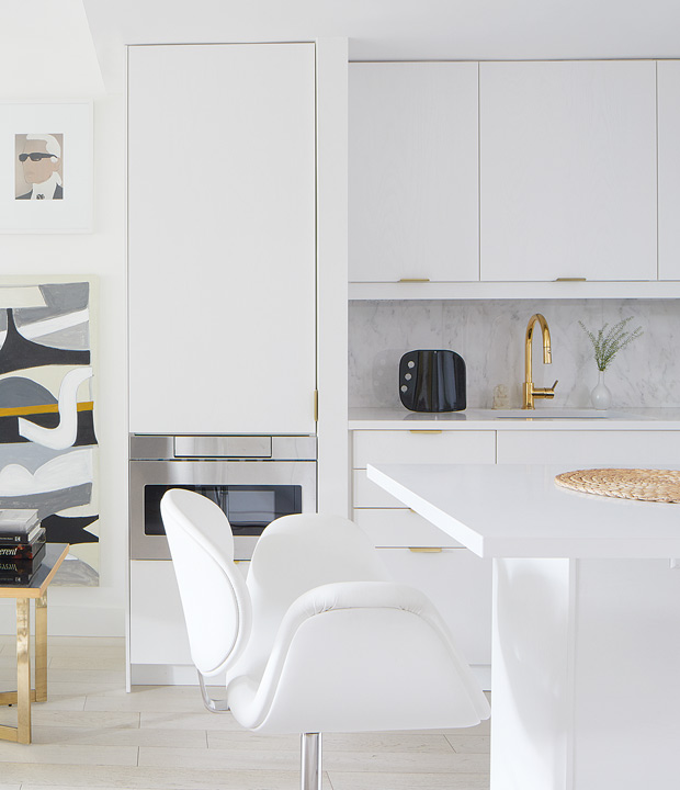
A polished gold, warm bronze or modern black faucet will pop in an all-white neutral kitchen — and there are more finish options on the market now than ever before.
Photographer: Virginia Macdonald
Source: House & Home August 2018
Designer: Christine Ralphs
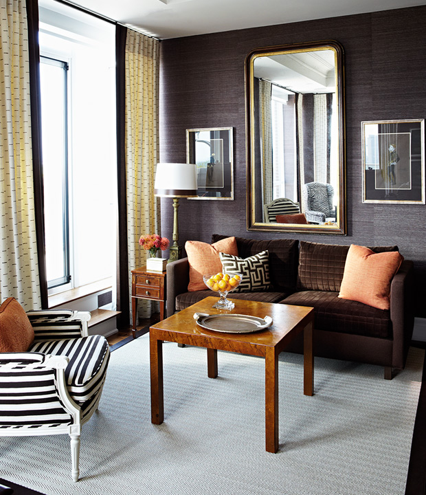
Rooms wrapped in grasscloth wallpaper never fail to feel rich and cozy. We particularly love darker tones, like the wallcovering designer Tommy Smythe selected for this handsome den.
Photographer: Michael Graydon
Source: House & Home June 2017
Designer: Tommy Smythe
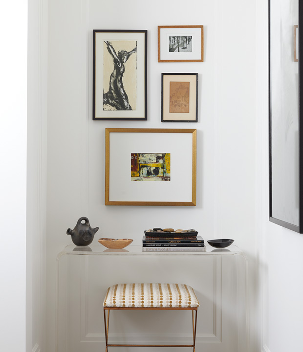
An underused niche can become a focal point if you pay careful attention to styling. Compose your display like a curator, and give only your most interesting objects plenty of room to breathe.
Photographer: Alex Lukey
Source: House & Home March 2018
Designer: Lisa Lev
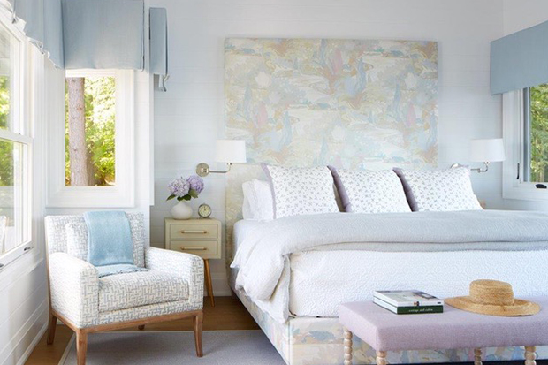
Stretching a headboard up towards the ceiling or running it horizontally across a wall are both ways to make the bed a true focal point in a room, and convey a sense of cocooning luxury. This photogenic variation is upholstered in a dreamy print and almost doubles as art.
Photographer: Virginia Macdonald
Source: House & Home August 2017
Designer: Anne Hepfer

Make your bathroom feel like a high-end spa by appointing a pretty accent table — like this exotic inlaid piece — with scented candles, brushes, soaps and a vase of fresh flowers.
Photographer: Donna Griffith
Source: House & Home April 2014
Designer: Kimberley Seldon
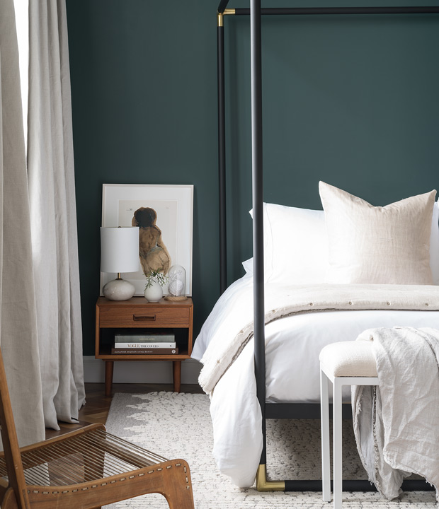
Deep shades of paint such as navy, emerald green and graphite are handsome choices for a principal bedroom. Here, Benjamin Moore’s Hunter Green makes the room feel particularly luxurious.
Photographer: Adrien Williams
Source: House & Home December 2017
Designer: BlazysGerard
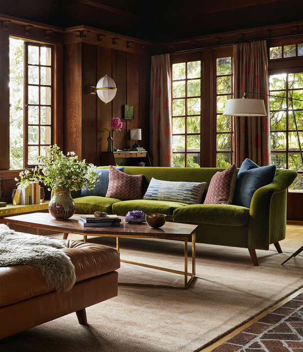
Plush and enveloping — especially on chilly nights — velvet seating delivers luxury in spades. It’s also a perfect fit with buttery leather upholstery.
Source: Commune Design
Designer: Commune Design
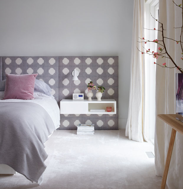
Free-floating furniture and shelving can make a room appear larger. There is some labour to affix the pieces safetly to the wall, but the payoff is a sleek, streamlined look that echoes the fixtures found in high-end boutiques and hotels.
Photographer: Virginia Macdonald
Source: House & Home April 2016
Designer: Sally Armstrong
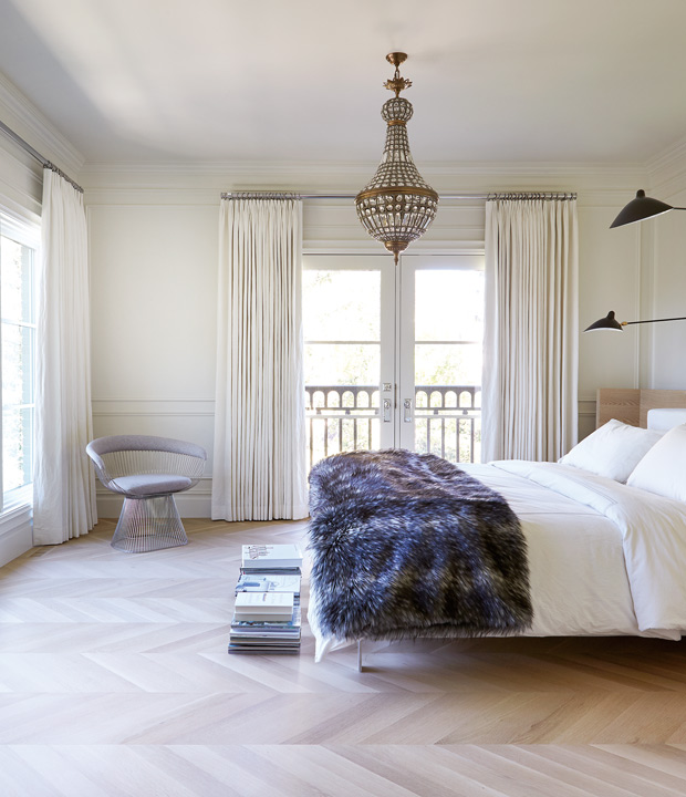
A synthetic throw infuses soft, sumptuous texture into a principal bedroom or guest room. Keep the rest of your linens simple to balance out the look.
Photographer: Colin Way
Source: House & Home May 2017
Designer: Nam Dang-Mitchell
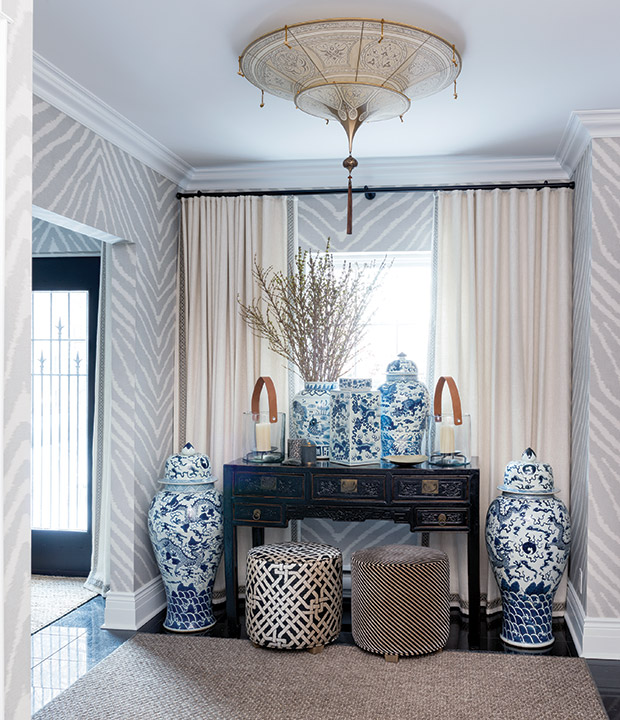
Chinoiserie vessels are a decorator classic that combines graphic pattern with artisanal flourishes. Designer Richard Ouellette of Les Ensembliers is a huge fan of ginger jars and notes: “Blue and white china is like a great pair of black pants. You can mix it up and play with it in any space.”
Photographer: Andre Rider
Source: House & Home October 2015
Designer: Les Ensembliers
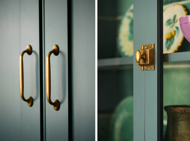
Nothing elevates big-box cabinetry quite like traditional latches, knobs and pulls. These handmade pieces by venerable British kitchen company deVOL are especially charming.
Source: deVOL
Designer: deVOL
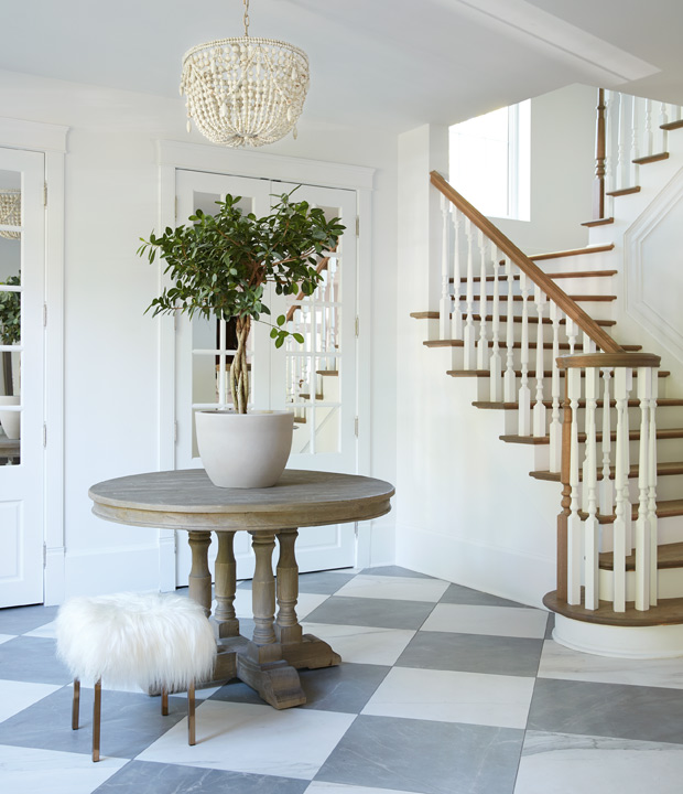
Forget florals. The most striking entries and hallways make a splash with a sculptural potted tree in lieu of the usual blooms.
Photographer: Maxime Desbiens
Source: House & Home June 2017
Designer: Melanie Cherrier

Whether you splash out on a mod designer tea set — like this cool Tom Dixon collection — or pull out your heirloom silver coffee service, a tray of showpiece vessels makes a refined focal point.
Photographer: Virginia Macdonald
Source: House & Home April 2017
Designer: Klaus and Beatrix Nienkamper
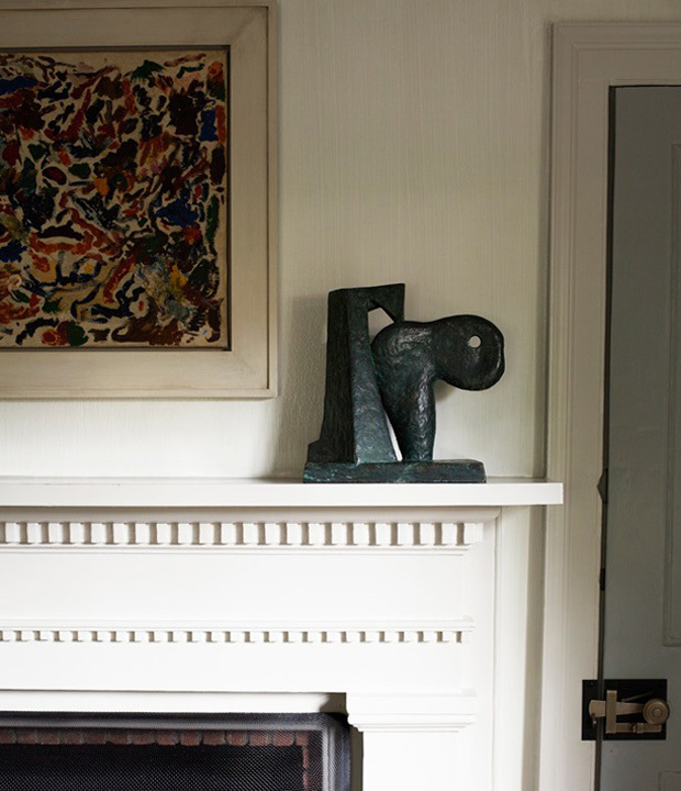
Abstract forms look stunning set on mantels, plinths or tabletops. Head to a local art show, studio tour or gallery to pick up an original piece (and, in turn, support the artist who crafted it).
Source: S.R. Gambrel
Designer: Steven Gambrel
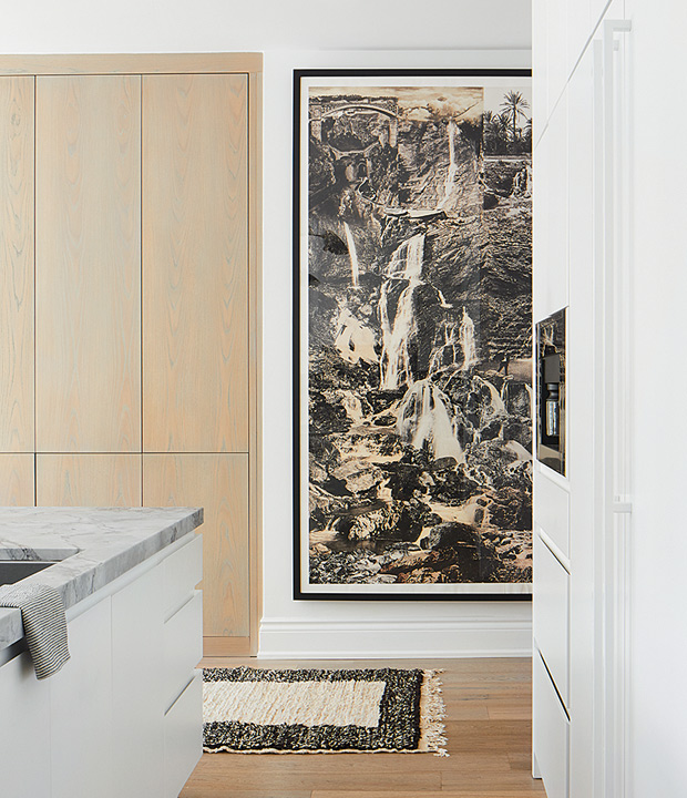
Large-scale prints make a strong, dynamic impression. Invest in a custom frame and high quality matting for a high-end effect.
Photographer: Virginia Macdonald
Source: House & Home May 2018
Designer: Montana Burnett
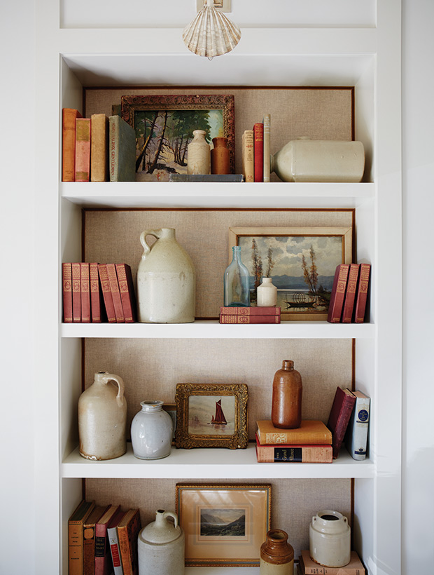
This hack is an easy way to instantly make bookshelves look high end. This classic decorating move brings pattern and texture to a room and doesn’t require a huge outlay for fabric or ribbon.
Photographer: Michael Graydon
Source: House & Home April 2016
Designer: Silvana D’Addazio
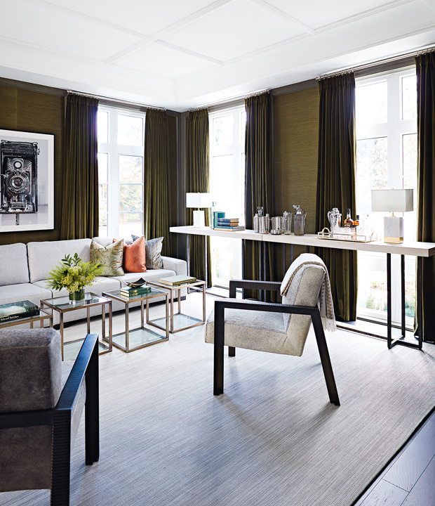
A fully stocked bar cart is a classic choice, but we especially love the look of a sleek tabletop setup. Corral mixing tools on a tray at one end of a slim console, and group glass decanters at the other end.
Photographer: Angus Fergusson
Source: House & Home December 2017
Designer: Brian Gluckstein
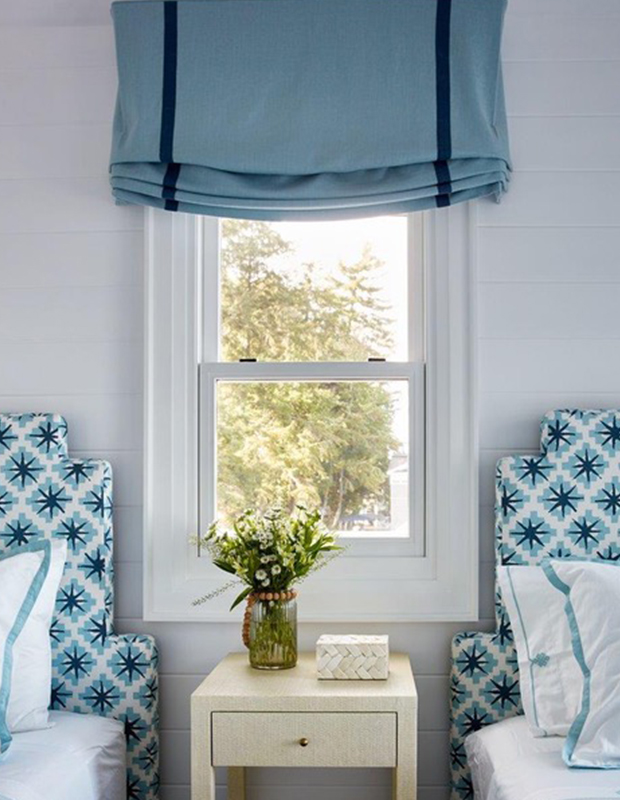
A curving profile on these twin beds perfectly nestles into the space around the window, and doesn’t block the light. Custom details always look more expensive, but luckily, handy types can DIY a headboard.
Photographer: Virigina Macdonald
Source: House & Home August 2017
Designer: Anne Hepfer

No budget for thickly veined quartz throughout your kitchen? You can still make a splash by installing a single slab as an attention-grabbing backsplash.
Source: Mason Studio
Designer: Mason Studio
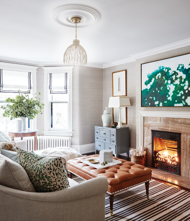
While adding coffers, faux beams or medallions to your ceilings is an extra expense, these kinds of details never fail to elevate a standard space.
Photographer: Stacey Brandford
Source: House & Home February 2016
Designer: Allison Willson
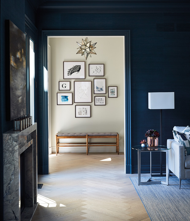
A herringbone or chevron pattern underfoot is a timeless choice, whether laid out in light wood or ceramic tile.
Photographer: Michael Graydon
Source: House & Home October 2016
Designer: Brian Gluckstein
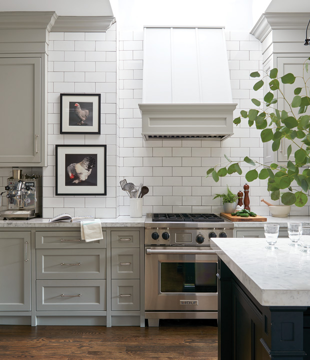
Clad your ventilation hood in tidy panelling and paint it the same color as your kitchen backsplash for a seamless look.
Photographer: Alex Lukey
Source: House & Home March 2016
Designer: Rachel Fox
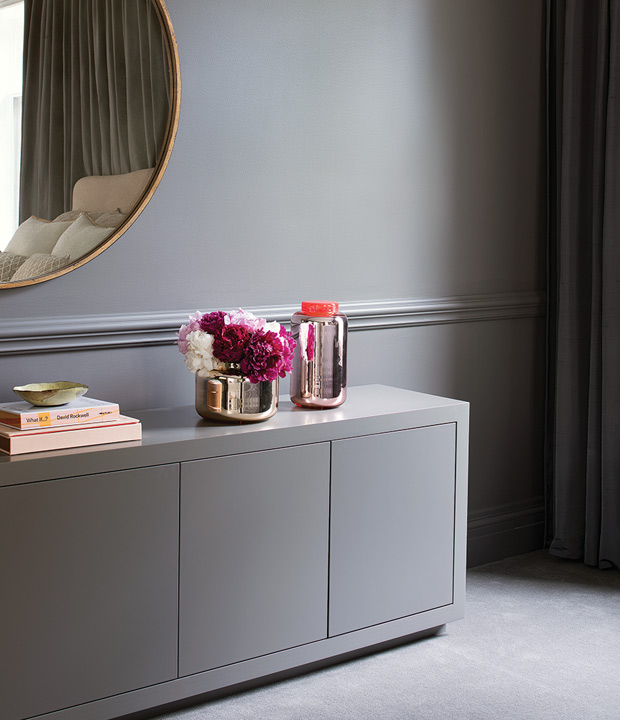
Get inspired by this principal bedroom, where a tonal palette of sophisticated greys gives the space a rich, cocooning appeal.
Photographer: Alex Lukey
Source: House & Home January 2016
Designer: Samantha Farjo
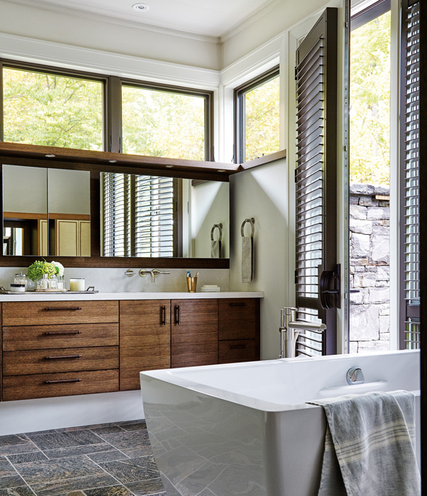
Installing shutters is another upfront investment you won’t soon regret. We especially love them in an ensuite bathroom, where they provide privacy and natural light.
Photographer: Donna Griffith
Source: House & Home September 2016
Designer: Margot Bell, Katelyn Hermant and Dasha Ricci

A simple way to set your subway tile apart from the pack is by selecting slightly irregular, textured tile with a handmade look.
Photographer: Adrien Williams
Source: House & Home October 2016
Designer: BlazysGerard
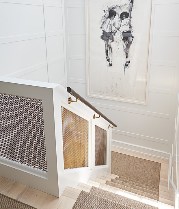
Luxurious details like a custom railing, high quality runner or statement artwork turn a transitional space into a spot to linger.
Photographer: Colin Way
Source: House & Home October 2016
Designer: James McIntyre

A bit of shine brings out the depth of a room’s wall and ceiling colors, making the space feel extra special.
Photographer: John Gruen
Source: House & Home March 2018
Designer: Garrow Kedigian
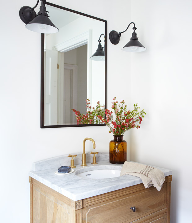
Hunt for a vanity with turned legs, interesting hardware or a rustic wooden finish to give your bathroom a bespoke aesthetic.
Photographer: Michael Graydon
Source: House & Home March 2013
Designer: Mandy Milks; Mazen El-Abdallah
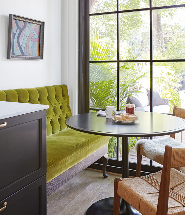
Adding a button-tufted banquette to an eat-in dining area is a simple way to inject both comfort and charm into a kitchen.
Photographer: Valerie Wilcox
Source: House & Home April 2018
Designer: Joel Bray
Up Next
15+ Tidy Kitchens That Will Inspire You To Show Off Your Cookware
